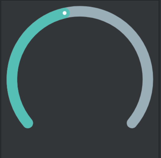
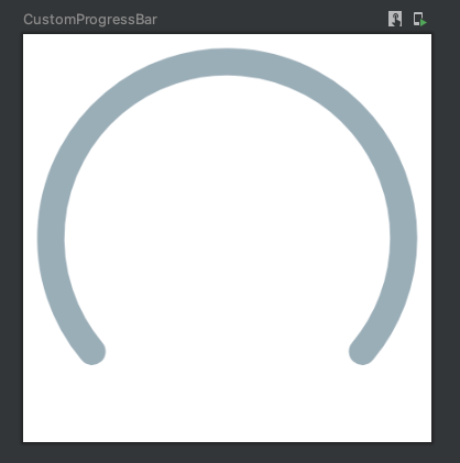
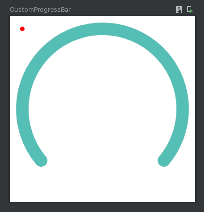
In this tutorial, you'll learn how to create a custom progress bar with Jetpack Compose Canvas API. The end result looks like the image below.
Steps for Creating Custom Progress Bar with Jetpack Compose Canvas API :
- Declaring a canvas
- Understanding the drawArc Composable API
- Drawing an arc for the background
- Drawing an arc for the foreground
- Drawing a circle
- Positioning the circle on the arc
Assumptions
- The radius of the circle is Half of the Height of the Widget.
- The color for the background arc will be
#90A4AE - The color for the foreground arc will be
#4DB6AC - The color for the circle on the custom progress bar will be
#FFFFFF
Declaring our Canvas
Let's start by creating our composable. You will call it CustomProgressBar. Go ahead and add this code to your project.
@Composable
fun CustomProgressBar() {

}
Jetpack Compose provides us with a Composable called Canvas. It takes a lambda called DrawScope.
Here is how you would declare it.
@Composable
fun CustomProgressBar() {
	Canvas() {

    	}
}
It is crucial to provide two things to your Canvas at this point. The first is the size and the second is the padding. Go ahead and set the size to 150dp and add 10dp of padding.
@Composable
fun CustomProgressBar() {
	Canvas(
    	modifider = Modifier
        .size(150.dp)
        .padding(10.dp)
    	) {

    	}
}
Understanding the drawArc Composable API
Jetpack Compose provides us with a composable function called drawArc(). This function requires 4 parameters to be declared:
brush: BrushColor or fill to be applied to the arcstartAngle: FloatStarting angle in degrees. 0 represents 3 o'clocksweepAngle: FloatSize of the arc in degrees that is drawn clockwise relative tostartAngleuseCenter: BooleanFlag indicating if the arc is to close the center of the bound
There are other parameters that offer you more customization, but they are not required, so I will skip over them for now.
Drawing an Arc For The Background
Go ahead and add the first arc like this
@Preview()
@Composable
fun CustomProgressBar() {
	Canvas(
    	modifider = Modifier
        .size(150.dp)
        .padding(10.dp)
    	) {
        	// Background Arc
            drawArc(
                color = Color(android.graphics.Color.parseColor("#90A4AE")),
                140f,
                260f,
                false,
                style = Stroke(10.dp.toPx(), cap = StrokeCap.Round),
                size = Size(size.width, size.height)
        	)
    	}
}
As the startAngle's 0 represents 3'o clock, I want to start drawing somewhere close to 7'o clock. That is the reason we use 140 for the startAngle.
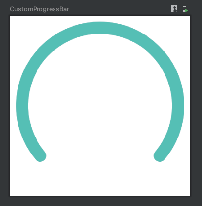
Drawing an Arc For The Foreground
Keeping everything the same, you will just add another arc, with a different color on top of this one.
@Preview()
@Composable
fun CustomProgressBar() {
	Canvas(
    	modifider = Modifier
        .size(150.dp)
        .padding(10.dp)
    	) {
        	// Background Arc
            drawArc(
                color = Color(android.graphics.Color.parseColor("#90A4AE")),
                140f,
                260f,
                false,
                style = Stroke(10.dp.toPx(), cap = StrokeCap.Round),
                size = Size(size.width, size.height)
        	)

            // Foreground Arc
            drawArc(
                color = Color(android.graphics.Color.parseColor("#4DB6AC")),
                140f,
                260f,
                false,
                style = Stroke(10.dp.toPx(), cap = StrokeCap.Round),
                size = Size(size.width, size.height)
        	)
    	}
}
Here is what the preview should look like
Drawing a Circle
A circle in its simplest form is also an arc, whose sweep angle is 360. So you can use the same drawArc API to draw a circle. However, Jetpack Compose provides us with another convenient API to draw a circle in an intuitive manner. The method is called drawCircle . It requires only one parameter to draw and that is the color.
Go ahead and add it to your canvas like this
@Preview()
@Composable
fun CustomProgressBar() {
	Canvas(
    	modifider = Modifier
        .size(150.dp)
        .padding(10.dp)
    	) {
        	// Background Arc
            drawArc(
                color = Color(android.graphics.Color.parseColor("#90A4AE")),
                140f,
                260f,
                false,
                style = Stroke(10.dp.toPx(), cap = StrokeCap.Round),
                size = Size(size.width, size.height)
        	)

            // Foreground Arc
            drawArc(
                color = Color(android.graphics.Color.parseColor("#4DB6AC")),
                140f,
                260f,
                false,
                style = Stroke(10.dp.toPx(), cap = StrokeCap.Round),
                size = Size(size.width, size.height)
        	)

            // Progress dot
              drawCircle(
                  color = Color.Red
              )
    	}
}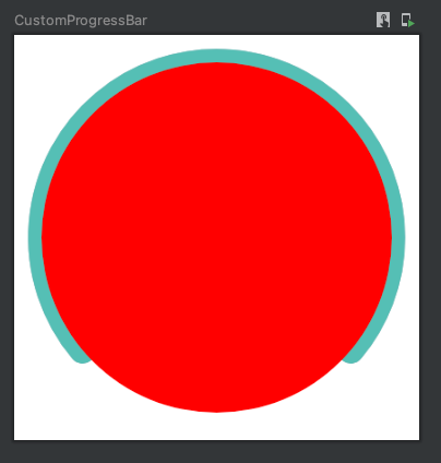
As you can see it added a circle at the center of your canvas and the radius is half the size of your canvas. So now you have to fix both of these things.
First, go ahead and set the radius to 5f.
@Preview()
@Composable
fun CustomProgressBar() {
	Canvas(
    	modifider = Modifier
        .size(150.dp)
        .padding(10.dp)
    	) {
        	// Background Arc
            drawArc(
                color = Color(android.graphics.Color.parseColor("#90A4AE")),
                140f,
                260f,
                false,
                style = Stroke(10.dp.toPx(), cap = StrokeCap.Round),
                size = Size(size.width, size.height)
        	)

            // Foreground Arc
            drawArc(
                color = Color(android.graphics.Color.parseColor("#4DB6AC")),
                140f,
                260f,
                false,
                style = Stroke(10.dp.toPx(), cap = StrokeCap.Round),
                size = Size(size.width, size.height)
        	)

            // Progress dot
              drawCircle(
                  color = Color.Red,
                  radius = 5f
              )
    	}
}
Great job resizing the circle! 👏
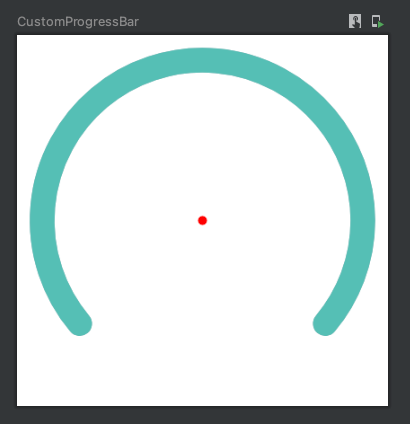
Now we need to position the circle onto the arc so that it matches your desired design. To achieve this, you have to provide the coordinates of the center of the circle as an Offset object. Go ahead and set this as (0,0) and see what happens.
@Preview()
@Composable
fun CustomProgressBar() {
	Canvas(
    	modifider = Modifier
        .size(150.dp)
        .padding(10.dp)
    	) {
        	// Background Arc
            drawArc(
                color = Color(android.graphics.Color.parseColor("#90A4AE")),
                140f,
                260f,
                false,
                style = Stroke(10.dp.toPx(), cap = StrokeCap.Round),
                size = Size(size.width, size.height)
        	)

            // Foreground Arc
            drawArc(
                color = Color(android.graphics.Color.parseColor("#4DB6AC")),
                140f,
                260f,
                false,
                style = Stroke(10.dp.toPx(), cap = StrokeCap.Round),
                size = Size(size.width, size.height)
        	)

            // Progress dot
              drawCircle(
                  color = Color.Red,
                  radius = 5f,
                  center = Offset(0f, 0f)
              )
    	}
}
You did not expect that to happen, did you? Do you know why this happened?
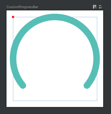
If you are paying attention, you'd be thinking but why does the circle not appear on the extreme top, left of your canvas? This is because you added 10 dp, padding to your canvas. Try removing the padding modifier and see what happens.
Android Studio can even show this is to you, just hover over your composable's design preview and it will show you a bounding box like this
In the next session, you'll see the code to position the circle correctly on the arc.
Positioning the Circle on The Arc
Here is how you can position the circle on the arc.
@Preview()
@Composable
- fun CustomProgressBar() {
+	fun CustomProgressBar(
+		progressPercentage: Float = 1.0f
+	) {
	Canvas(
    	modifider = Modifier
        .size(150.dp)
        .padding(10.dp)
    	) {
        	// Background Arc
            drawArc(
                color = Color(android.graphics.Color.parseColor("#90A4AE")),
                140f,
                260f,
                false,
                style = Stroke(10.dp.toPx(), cap = StrokeCap.Round),
                size = Size(size.width, size.height)
        	)

            // Foreground Arc
            drawArc(
                color = Color(android.graphics.Color.parseColor("#4DB6AC")),
                140f,
-                260f,
+				progressPercentage * 260f,
                false,
                style = Stroke(10.dp.toPx(), cap = StrokeCap.Round),
                size = Size(size.width, size.height)
        	)
+         var angleInDegrees = (progressPercentage * 260.0) + 50.0
+         var radius = (size.height / 2)
+         var x = -(radius * sin(Math.toRadians(angleInDegrees))).toFloat() + (size.width / 2)
+         var y = (radius * cos(Math.toRadians(angleInDegrees))).toFloat() + (size.height / 2)


            // Progress dot
              drawCircle(
-                  color = Color.Red,
+                  color = Color.White,
                  radius = 5f,
                  center = Offset(x, y)
              )
    	}
}If you'd like to understand in-depth, how I came up with the x and y coordinates, you can read this fun blog post on How to Find a Point on a Circle in Kotlin.
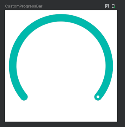
The result should look like this
Conclusion
Kudos on learning how to create a custom progress bar with Jetpack Compose Canvas API. I hope you enjoyed this article.
Before you go, let's connect with each other on Twitter!
What an amazing start to my Sunday! 😍 @androidweekly (Thank you 🙌) featured my blog in their latest newsletter today!
— Ishan Khanna (@droidchef) May 22, 2022
Go read it if you haven't 👉 https://t.co/IGaKiI2LzS
and don't forget to subscribe for the Behind The Scenes at the end 😉#AndroidDev #Kotlin #FEATURED https://t.co/xUPH7hIJYw